Approximately 80 percent of Internet users own a smartphone. It’s no wonder why mobile users surpassed desktop computers for bandwidth used online. Instead of heading home and getting on the computer to look something up or to chat on Facebook, people can do it while at the grocery store.
Because mobile technology is so prevalent in today’s society, a new way to develop websites has been formulated. Thus enters in the idea of a mobile-first index.
What this means is that your website will be judged based on its capacity to work in a mobile environment. For instance, Google’s indexing algorithms will pit your layout and the site’s overall functionality against how it would perform on a smartphone.
Why is the Mobile-First Index So Important?
Mobile devices play a crucial role in how sites are designed today. Not only will people abandon a website if it looks poorly on a smartphone display, but as many as 57 percent of users state they will not recommend that site.
In the smartphone and tablet era, design needs to incorporate a variety of elements and layouts for smaller displays. Things like small fonts and difficult-to-operate navigation can easily decrease visitor engagement.
The loss of interaction can lead to decreased sales, visitor interaction and hits to a brand’s reputation. By putting more effort into mobile-first index SEO, you can avoid most of these issues.
Here are 10 of the best optimization tips I can find for improving your site for Google mobile indexing.
1. Scan Your Site for Flaws
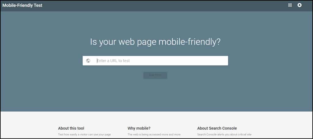
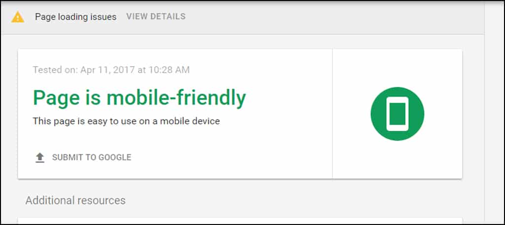
The first step you should take is to scan your site for flaws when it comes to mobile search engine optimization. Using tools such as Google’s Mobile-Friendly Test can be instrumental when developing design strategies.
The test just takes a moment of time but will demonstrate how well your design performs in a hand-held environment. It will display any errors the site may have while being indexed by Google’s site crawler. This test will also show elements that are blocking Googlebot by design, such as advertiser links.
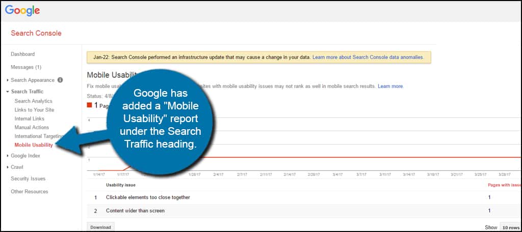
It will also be beneficial to take a look in your Webmasters Tools Search Console. Google has added a “Mobile Usability” report under the Search Traffic heading that will show issues regarding the site. This is because of the January 22nd, 2017 infrastructure update which analyzes various elements of your site for mobile interactivity.
For example, elements that are too close together or wider than the screen on a mobile device will cause errors. These pages with issues should be addressed immediately if you want to continue scoring well in SEO.
2. Transition to Responsive Design
According to Google, responsive design is more appealing than a separate mobile version of a website. This is because it eliminates a wide range of issues people are now having trying to maintain both desktop and mobile aspects.
Responsive design is a method used that will automatically adjust the layout of a website depending on the screen resolution of the visitor. It makes it easier for people to share content, is less demanding of time for development and most importantly saves resources when Googlebot crawls your pages.
Instead of having two completely separate URLs for content, you only use one. One of the biggest problems this eliminates is making sure both desktop and mobile sites have the same content available.
Implementing responsive design also helps avoid some of the most common mistakes in development. For instance, you will be less likely to have faulty redirects or irrelevant cross links between desktop and mobile versions of content.
One other aspect some people don’t consider is the amount of work that goes into setting up a mobile site as opposed to responsive design. For one, the mobile site requires a separate domain or subdomain if you want to do it correctly. Responsive can be done from a single URL and file structure.
3. Optimize Your Content for Mobile Users
You probably already know that a wall of text plays poorly for mobile users. This is when someone is faced with a seemingly long block of content without paragraphs or headings.
It’s all about keeping your target audience engaged. If they come across an ultra-long piece of content, it often turns people off. This is because text on a mobile screen can be quite difficult to read for some.
Keeping paragraphs short and highlighted with headings and sub-headings makes the content easier to absorb. This is true for both humans and search engine bots alike.
When you look at a screen on your smartphone that has completely filled the display with text, do you get excited to read it? I am willing to bet that most of you actually feel the same dread I do when I see a long block of words crammed together in the palm of my hand.
4. Consider Your Link-Building Strategy
The way you build links may also reflect the website’s performance in the mobile arena. Don’t forget, Google likes relevant and quality connections between content. This means you’ll need to pay closer attention to what material you link out to.
For the most part, link building should remain relatively unchanged with one major exception: making sure a mobile link connects to a mobile site. I’ve experienced a few websites on my smartphone where the developer linked to a source that was not mobile ready. As a result, I couldn’t read the text very well and it was a pain to manage.
Needless to say, I left the site in search of similar content. And that’s where the truth lies. If someone cannot manage your site, they will look elsewhere.
You want to avoid linking a mobile site with a desktop version. Sometimes this happens in development on mobile-only versions where the content creator accidentally creates an “internal” link to the desktop version.
Yet, another reason to use responsive design instead.
5. Optimize Headings and Titles
Title optimization has been a concern for many over the years. At one point, users were allowed up to 65 characters before the infamous ellipses, or “…“, would show. Now experts attest this number can go as high as 70.
In reality, Google shows results according to a length governed in pixels. For instance, one title can show 53 characters before being truncated while another can show more than 60. It all depends on what can be shown in a specific space on the search engine.
For instance, I just counted characters in a Google search result page from my smartphone and found one to be truncated at 55 while another was at 65.
Does this mean that titles don’t matter? Not exactly. It’s still advisable to keep them at a length that can be easily seen in search. Just bear in mind that Google only scans about 600 pixels worth of characters for those results.
Proper use of headers is also vital for page indexing. Even from a mobile perspective, achieving the top as a Google featured snippet is ideal to attract attention to the website. More often than not, smartphone users will click on the top result. Since a snippet is ahead of all results except paid ads, this is prime search engine real estate.
6. Make Elements “Touchable”
It’s one thing to create a link for someone to click, but it’s another when you have too many clustered together. How often have you come across a site where you had to pinch to zoom so you could click a link or a button?
In fact, making elements touchable is such an important aspect that it’s an error counted on your website when you view the Google Search Console. This is because a site needs to be easy to use. Users unable to click the correct link because it’s too close to another is viewed poorly in the mobile-first index.
So, what can you do to avoid link clusters?
- Use larger and easier to tap buttons instead of links.
- Keep linked materials away from each other in content.
- Use mobile-optimized menus instead of link navigation.
If you’re worried about using image buttons instead of links for SEO, don’t fret. That’s what the “ALT” tag is for. Adding alt text to images essentially tells Google what the graphic represents so it can be correctly indexed.
7. Eliminate Flash
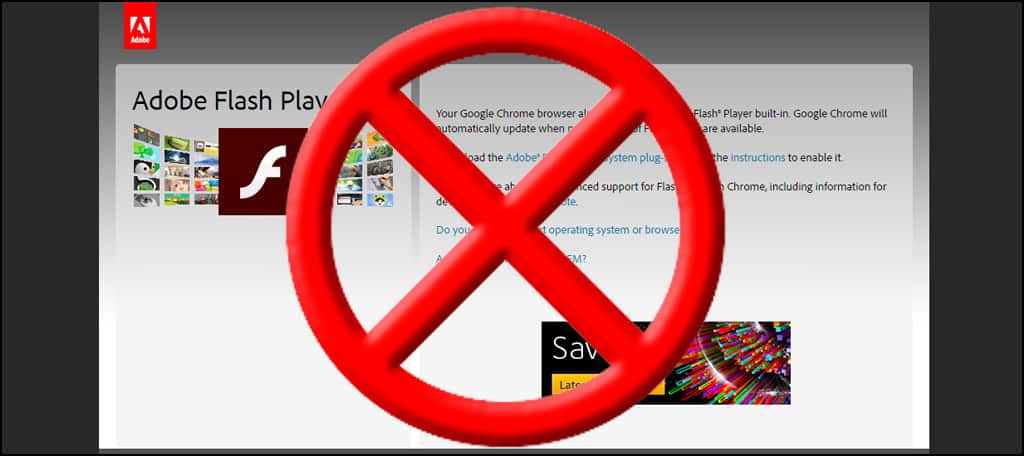
Rest in peace, Flash. In its day, Flash was an amazing concept for animation and video use on the Internet. Unfortunately, it’s now an archaic form of content delivery that has long been superseded by HTML5 and JavaScript.
Flash is not supported by every mobile browser. As a result, these elements will break making it a poor experience for the user. This, in turn, reduces the ranking of your site in Google.
Using HTML5 and JavaScript is a far better plan of action, and not just because it’s beneficial to mobile users. These two technologies are easier to render and have significant performance improvements over Flash.
A good example of this transition is when you look at YouTube. Once a prominent user of Flash video files, YouTube has changed its format. This resulted in far better security as well as vastly increasing performance in streaming video content.
And this isn’t just for mobile devices either. Desktop computers run HTML5 and JavaScript far better than Flash as well.
8. Keep the Site Fast
Website speed is important whether people are using smartphones or older desktop computers. The faster your site, the better it performs in Google.
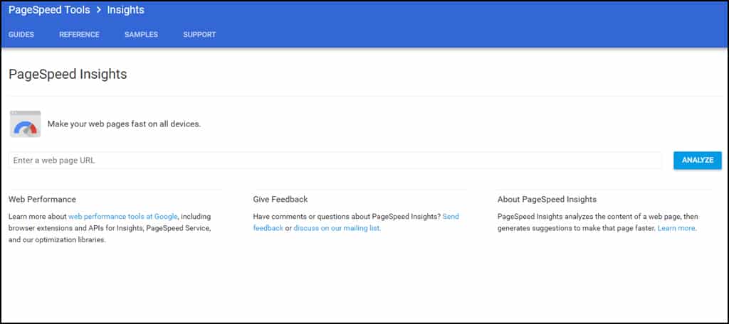
Because speed plays such a vital role in search engine results, Google offers a free tool to test your pages. PageSpeed Tools not only analyzes your website for performance, but it will also tell you how to improve.
Google isn’t the only site that offers valuable insights into site speed performance, either. Another is the Pingdom speed test. By scrutinizing the various elements of your site, you can get a picture of just what is slowing you down.
As mobile devices are driven by convenience, most users want sites to load up quickly. In fact, approximately 53 percent of mobile users will leave a website if it takes longer than three seconds to load up.
Images, coding, responsive elements, ad serve networks and more all contribute to how long it takes for a page to render in a browser. Any millisecond you can shave off improves your chances of not losing the audience.
9. Continue to Optimize for Desktop Systems
The most important aspect to your SEO strategy is to not give up optimizing for desktop computers. This is because of two very important reasons:
- Desktop and laptop computers still contribute to more than 58 percent of Internet activity in the United States.
- Not all search engines use the same algorithms as Google.
Although Google remains one of the top search engines on the Internet, it’s not the only one in action. Bing, Yahoo and even DuckDuckGo are all viable methods for many people.
In many ways, the same SEO techniques for desktops can be used for mobile engagement. Things like speed, links, quality content and more are all relevant to a site regardless of the technology.
While mobile optimization is a valid concern, it should be more of an added strategy and not a replacement.
10. Optimizing for Local Users
For businesses that focus marketing on local buzz, optimizing the site for mobile users is also important. This is because more people are turning to Google search to find local businesses than the traditional phone book.
This optimization includes adding your city and state to things like the title tag, H1 headings, alt tags, meta descriptions and URLs. Since people often trust a business that displays contact information, making sure this is prevalent on the mobile site is also important.
Approximately 50 percent of smartphone users and 34 percent of tablet users visit a store they research online the same day. Without optimizing for mobile technology, the business could be losing out to nearby competitors.
How Does Your Site Stack Up?
As more people browse the Internet from their smartphones, the need for optimizing for the mobile-first index in Google grows apparent. Each passing second your site sits without making these adjustments is another potential customer giving money to the competition. An optimized web hosting service can only do so much. It’s up to you to make certain improvements to the website itself for mobile indexing in Google.Special Offer:
Win Piriform CCleaner Professional Giveaway (10 x Full Licenses) support by Group Buy SEO Tools http://www.bestseotools.cc
https://www.piriform.com/ccleaner
Mention this giveaway part on your blog, and send us link at doogeetop@gmail.com, you can a chance get free Piriform CCleaner Professional V5.30 license.
Related:Group Buy SEO Tools
Related:http://www.bestseotools.cc


I got what you mean , thanks for posting .Woh I am happy to find this website through google. internet marketing omaha
ReplyDeleteI really enjoyed reading this post, big fan. Keep up the good work andplease tell me when can you publish more articles or where can I read more on the subject? http://seoagencychina.com
ReplyDelete